
Melbourne Metro
Poster and logo design for the new Metro stations. Mixing the nostalgic heritage of what the metro was and modernising it through the use of geometric shapes and lines. The lines throughout the poster mimic the train lines within the suburbs of Melbourne, with an embedded artifact found on the site of the metro.


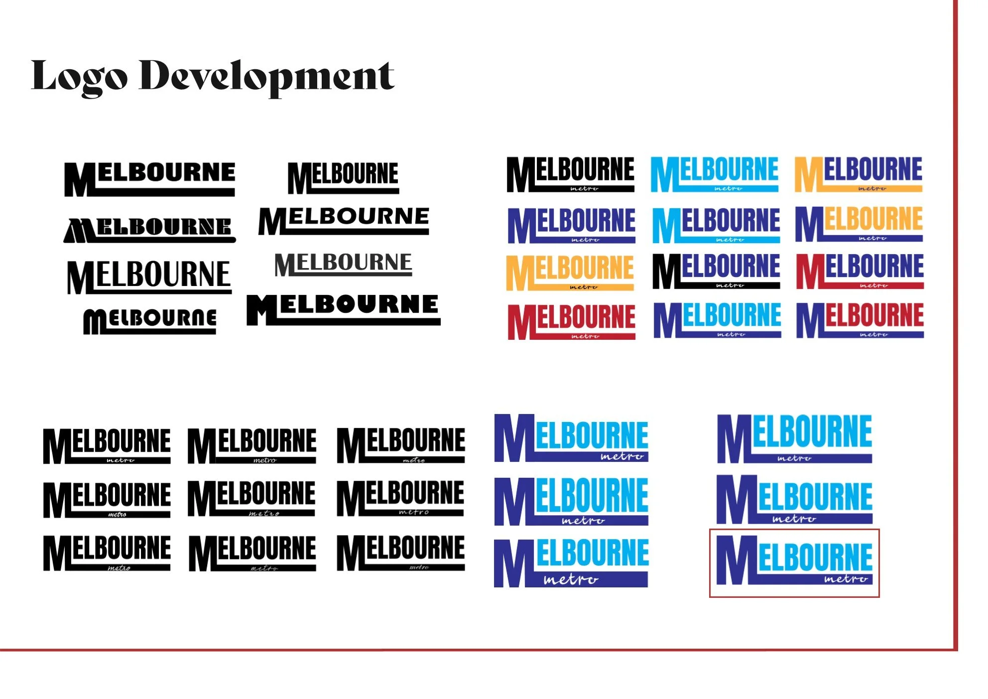
Logo Development


Poster Development


Final

I wanted to create a poster that was nostalgic yet also modern. Utilising a retro/vintage colour scheme helps to add that feeling of nostalgia and what once was. That colour scheme made up of muted red, blues, greens and yellows contrasts against the vibrant cyan of the new train line and the circles along it marking the 5 new train stations, all the lines throughout the poster mimic the train lines within the suburbs of Melbourne, some more closely than others. Considering the heritage of the site on which the new stations are built, the artefact of a wine bottle found on site is used in this design. I decided to take a more geometric abstract approach turning the curved lines of the bottle into straight ones. The bottle is now embedded into the design and concreted using shape and the colour yellow. Having the bottle itself in the design was quite distracting and transforming it this way allows for a more blended and cohesive poster, nestling the bottle among the train lines. The graphic train illustration in the foreground is the focus of the poster and without reading the text, viewers will make the association that the poster is related to the Melbourne Metro. I wanted to ensure that the train wouldn’t stand out compared to the rest of the poster but act as one with all the elements. The secondary focal point is the cyan line with the names of the new stations, reading left to right and ending on the artefact. This depicts where we are now in terms of the metro system and where we once were. A san serif font was chosen due to its legibility as well as the fact that it matches the rebranded logo for Melbourne Metro. Due to the font not having serifs, it allows for the lines of the letters to be elongated through proximity of the train lines and adds a kind of continuity to the design. The logo being part of this element with the M joining onto one of the train lines